
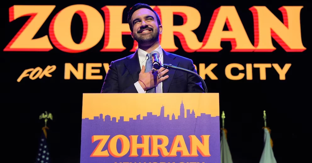
When Zohran Mamdani launched his groundbreaking bid for New York City mayor, his campaign visuals — bright blue signs with bold orange lettering — quickly became one of the race’s most talked-about features.
From Queens to the Bronx, the “Zohran for New York City” signs stood out from traditional red, white, and blue campaign designs. While many saw the color scheme as a nod to Bollywood posters and Mamdani’s Indian roots, designer Aneesh Bhoopathy said the inspiration came from something much closer to home — the colorful visual language of New York’s bodegas, yellow cabs, and hot dog stands.
“The design was meant to feel like New York itself — energetic, diverse, and alive,” said Bhoopathy, a Philadelphia-based designer who had previously worked with Mamdani and the Queens chapter of the Democratic Socialists of America.
A bold, nostalgic look that resonated
The campaign’s bold colors and vintage font — echoing hand-painted signs and comic book covers — offered a striking contrast to more conventional political branding. The look even influenced Mamdani’s main rival, former New York Governor Andrew Cuomo, who later switched to a blue-and-orange color palette featuring the Statue of Liberty’s crown — also the colors of the Knicks and Mets — after losing the Democratic primary to Mamdani.
Mamdani, soon to become New York’s first Muslim and South Asian mayor, is the son of Columbia University scholar Mahmood Mamdani and filmmaker Mira Nair, best known for Monsoon Wedding.
Design experts said the campaign’s aesthetic did more than just look good — it told a story about the city itself. “It reflects the working-class fabric of New York — the bodegas, taxi cabs, and halal carts that sustain it,” said David Schwittek, a digital media professor at Lehman College.
Gavan Fitzsimons, a marketing professor at Duke University, said the retro tone likely evoked nostalgia among voters: “It felt like a throwback to a time when politics seemed less divisive and more hopeful.”
Some US states introduce gun safety lessons for schoolchildren
A new visual language for progressive politics
Analysts also drew parallels to Rep. Alexandria Ocasio-Cortez’s 2018 campaign, which used bright colors and upward-slanting lettering inspired by labor movement posters and Mexican Lucha libre flyers. Richard Flanagan, a political science professor at the College of Staten Island, said both campaigns used design to connect heritage, community, and movement politics.
While experts say it’s too early to tell whether Mamdani’s visuals will reshape campaign aesthetics nationally, his team’s work has already sparked copycat designs and viral fan-made merchandise — including the “Hot Girls for Zohran” line worn by model Emily Ratajkowski.
“The playfulness of his branding made people want to be part of it,” said NYU marketing professor Court Stroud. “It turned campaign design into a shared identity.”
Design with meaning
Media scholar Lisa Burns of Quinnipiac University noted that most candidates still rely on the “safe” red, white, and blue palette — but Mamdani’s success may inspire more risk-taking.
“In a sea of sanitized political messaging, Mamdani’s visuals stand out because they mean something,” said Schwittek. “They reflect who he is and where he comes from.”
Designer Bhoopathy agreed, saying the campaign’s energy matched the candidate’s own
Source: AP