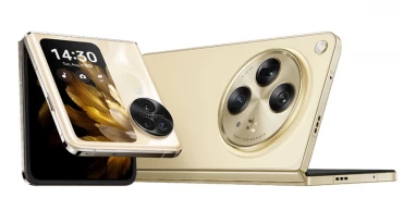
OPPO Foldable Phone
OPPO Find N3 Review: A New Standard for Foldable Smartphones
The Find series from OPPO has been their premium flagship range since the brand’s inception. It brought top-of-the-line features that competed for the best of what Android has to offer. Back in 2021, the N series was introduced as OPPO’s first take on foldable and flip phones. Fast forward to 2023, OPPO released the Find N3 foldable smartphone on 19th October in China. The N3 brings some big and effective changes compared to the N2. Let’s find out what those are.
Key Specifications of OPPO Find N3
Design and Build Quality
The Find N3 doesn’t really reinvent the wheel. It looks similar to the existing range of foldables from the likes of Huawei and Samsung. There is a distinct round camera housing on the back with Hasselblad branding that gives it its distinguishing look.
Coming to the design specifics, the curves around the hinges have been sharpened. It might be due to the hinge mechanism used in the N3. Speaking of the hinge mechanism, it now does an excellent job of dissipating the crease at the middle of the inner display. It’s still possible to feel the crease by touch, but visually it is much less pronounced compared to the Mate X5 or the Z Fold5.
Read more: Top 10 Smartphones Coming to Bangladesh in November 2023
The front glass and aluminum frame are complemented by a choice of either a glass back or an eco-leather back. The dimension comes in at:
Glass Folded: 153.4 x 73.3 x 11.7 mmEco-leather Folded: 153.4 x 73.3 x 11.9 mmGlass Unfolded: 153.4 x 143.1 x 5.8 mm Eco-leather Unfolded: 153.4 x 143.1 x 6.0 mm
The weight comes in at 239 g for the eco-leather option and 245 g for the glass-back variant. The front is protected by OPPO’s own Ceramic Guard protection with the inner panel being a plastic one as usual. The choice of ports and buttons are carried over from the N2 which means the 3.5 mm headphone jack didn’t make the cut. The power button doubles as the fingerprint scanner similar to the N2.
Read more: Xiaomi Redmi Note 13 Pro Plus Review: Know the Pros and Cons
Another useful addition this time around has been the IPX4 splash resistance rating. Overall, the updated hinge mechanism massively improves the experience and alleviates the design experience of the device.
The Display
OPPO used the new state-of-the-art LTPO3 OLED panels for the N3. The cover screen is a 6.31-inch panel with 1116 x 2484 pixels with 431 ppi density. The panel supports 1.07B colors, Dolby Vision, 120Hz refresh rate, and 2800 nits of peak brightness in HBM.
On the other hand, the inner panel is a 7.82-inch Foldable LTPO3 OLED panel with 2268 x 2440 pixels resolution at 426 ppi. The panel supports 1.07B colors, Dolby Vision, 120Hz refresh rate, and 2800 nits of HBM. The screen-to-body ratio of the N3 comes in at 89.6%.
The best thing about the N3 display is the utilitarian design. The cover screen isn’t unnaturally tall like that of the Z Fold5. Rather it looks much like a standard smartphone. The inner screen is also 1:1 which gives it a square look. This display design enhances the usability all the while being a cutting edge panel.
Read more: vivo V29e 5G Review: Is this mid-range phone rightly priced?
Being an LTPO3 panel, the screen is everything one would expect from it. It has high contrast, great color, and amazing visibility under direct sunlight. And thanks to the new hinge mechanism, the inner crease also isn’t as distracting anymore.
2 years ago

